MAWANI

BRAND IDENTITY

BRANDING / PHOTOGRAPHY / SOCIAL MEDIA
OVERVIEW

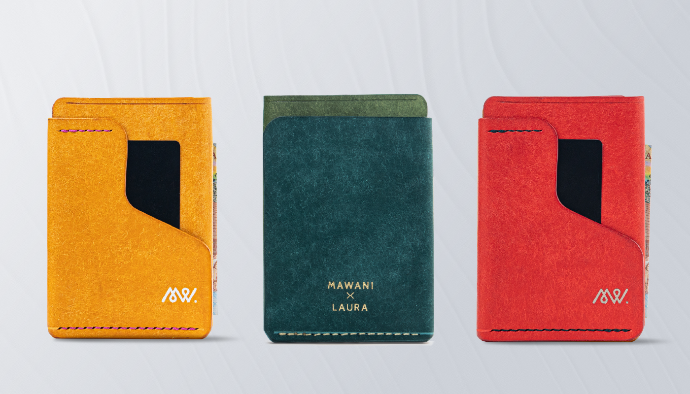
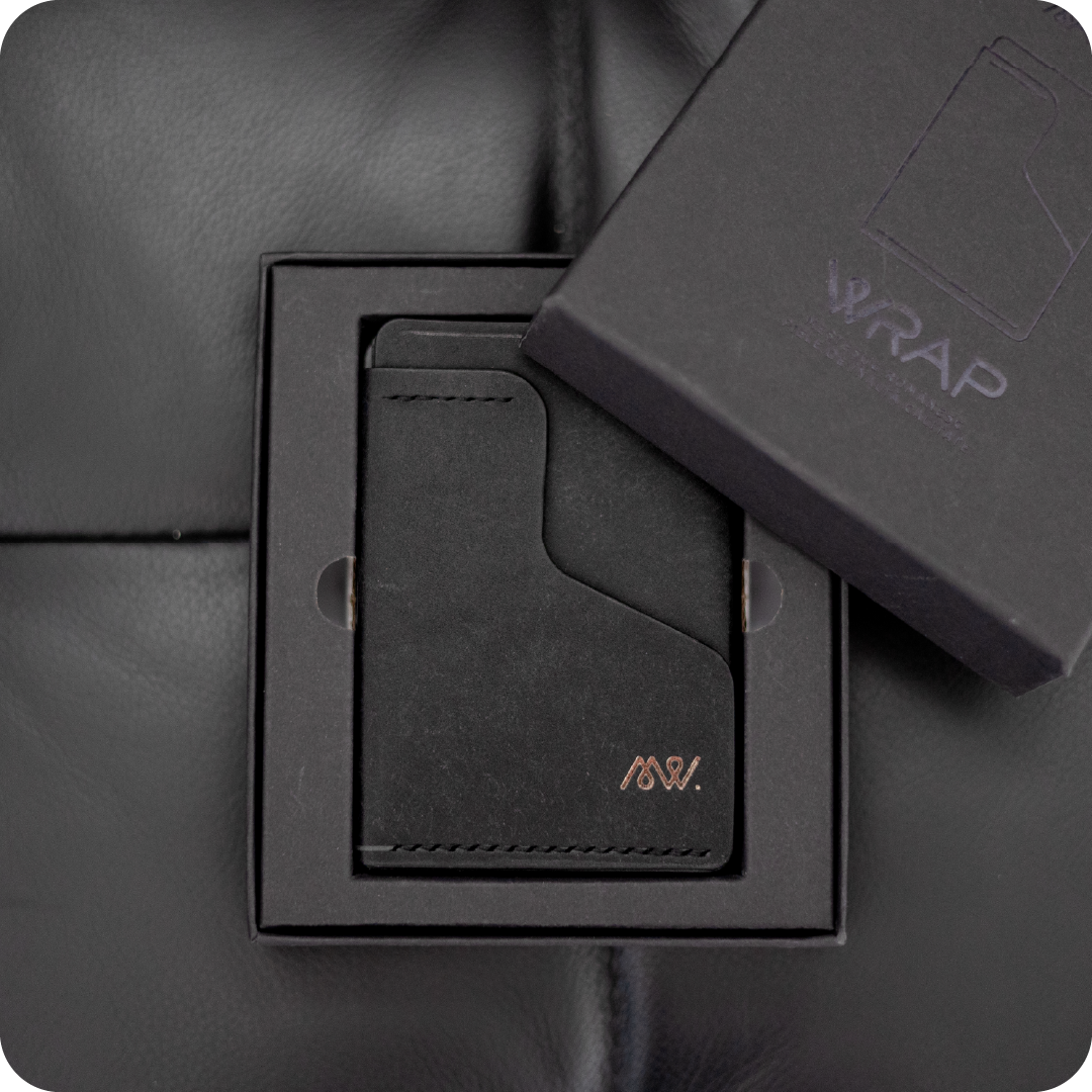
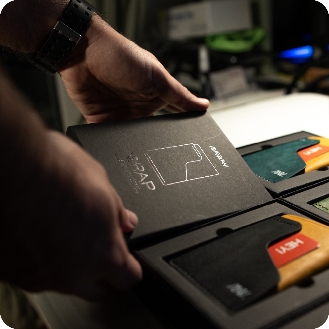
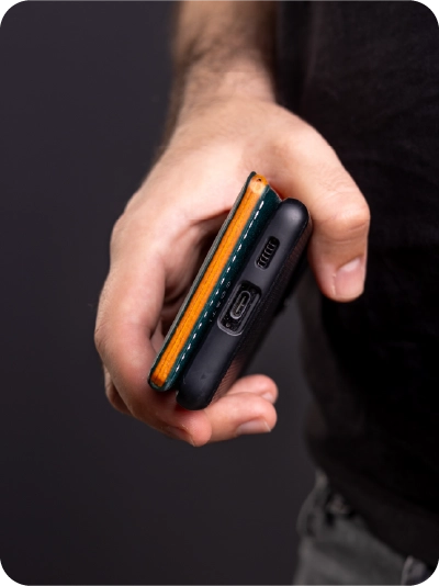
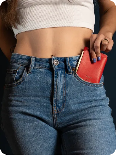
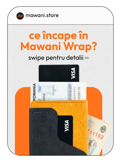
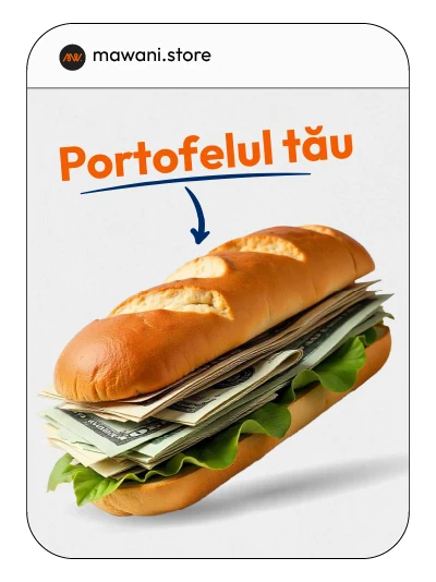
MAWANI was born from a simple frustration: wallets were getting bulkier, uglier, and more complicated than the lives they were supposed to simplify.

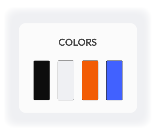
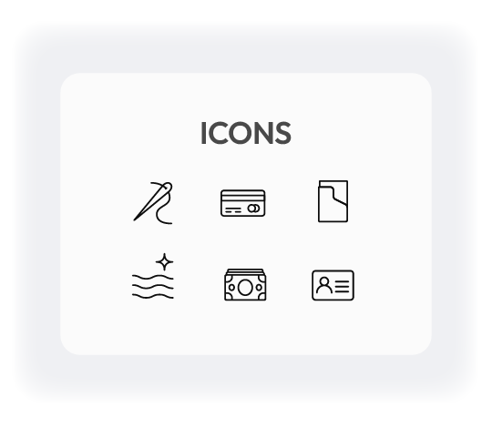
Our job was to build a brand universe that does the opposite, something sharp, clean, and unapologetically minimalist, but with a spark of personality that makes you feel something the moment you see it.

SERVICES

BRANDING / PHOTOGRAPHY / SOCIAL MEDIA

INDUSTRY

FASHION ACCESORIES

YEAR

2024
THE STORY
MAWANI is a modern take on craftsmanship. Handmade wallets, symbolic colorways, and a philosophy built around essentialism. The challenge wasn’t to make MAWANI look premium. The challenge was to make it feel like a brand with a point of view — something people want to be part of.

We defined MAWANI’s core traits early:
Minimal. Bold. Human. Playful.

These keywords shaped every visual decision that followed. The early sketches show how we explored balance — simplicity without sterility, expressiveness without clutter.

#story
#brandstrategy
#brandidentity
BRAND
ASSETS
  • The color palette is intentionally restrained. The base colors represent the everyday minimalism of MAWANI — quiet, structured, balanced. But the accent colors? That’s where the brand’s personality comes alive.  
  • Typography is one of the brand’s strongest invisible tools. The type system is modern, clean, and effortlessly readable. Headings lead with confidence, while body text stays out of the way, letting product visuals shine.
  • The iconography follows the same minimalist philosophy as the brand — clean geometry, consistent strokes, and soft angles inspired by the wallet’s craftsmanship.
LOGO
DESIGN
The MAWANI logotype is designed to feel timeless: clean geometry, balanced proportions, and a rhythm that feels both handcrafted and modern. The monogram acts as a compact signature — subtle when you need it, iconic when you want it.

Placed on leather, packaging, or digital screens, the logo doesn’t shout. It whispers confidently. The grid system and clear space rules ensure consistency across every application, from embossing to browser tabs.

PRODUCT &
PACKAGING
The logo sits on the wallets with a clean, confident presence — subtle enough to keep the minimalist aesthetic intact, but sharp enough to feel instantly recognizable.

The packaging follows the same philosophy as the product: refined simplicity. A clean box, a tactile surface, and an embossed monogram that elevates the unboxing experience.
It doesn’t try to compete with the wallet. It frames it — the way a good picture frame completes the artwork inside.
PHOTOS
The photography captures MAWANI exactly as it’s meant to be experienced — in real hands, real pockets, real moments. Clean lighting and tight compositions highlight how slim and practical the wallets truly are, while lifestyle shots add warmth, personality, and human connection.

The result is a visual story that feels genuine, modern, and effortlessly wearable — just like the product.

SOCIAL 
MEDIA
MAWANI’s social presence needed the same balance as the brand: minimal yet full of personality. The content system mixes product showcases with playful copy, storytelling carousels, behind-the-scenes shots, and color-driven posts.

The tone is young, direct, and charmingly irreverent — making even a wallet feel like a conversation starter.

Everything is built for speed: templates that let the brand post consistently, without losing quality. Because a brand that looks good only once… isn’t really a brand.

WEB
DESIGN
The MAWANI website was designed to feel as light as the product itself. We stripped away noise and left only what matters: big visuals, simple flows, fast decisions.

Each section guides the user effortlessly.

The UI balances minimalism and personality, letting the brand breathe while keeping product photography front and center.
It’s a calm space in a noisy digital world.